Module # 2 Google Table, Tableau and Geographic map
For this week's dataset, I looked into the 5000 fastest private growing companies in the United States over 4 years. Using Tableau I created a visual to show me where the most successful companies were based. On the map, the darker states correspond with both the rank and amount of workers in each of the companies. Darker shades led to more workers and higher rank, while lighter shades represented the opposite.
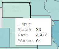
Here we can see South Dakota as one of the lighter-colored states in the United States, with a rank of 4,937 and only 64 workers we can see why it is so lightly shaded.
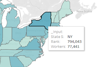
Compared to that of New York's darker-shaded state, showing a much more significant ranking of 794,043 and 77k plus workers.
Ways to improve this map would be a legend on the side of the United States map, here 2-4 different shades could be added. Showing the general difference between the state's rank and workers. Gestalt Laws would also be useful here, as the bigger ranked states could be grouped together to emphasize trends across regions.
.png)
%20.png)
.png)

Comments
Post a Comment